An 11-piece infographic series for Herberger Institute Student Success — designed to make complex wellbeing topics accessible, visual, and actionable for students.
Herberger Institute Student Success needed a series of infographics to help students navigate complex wellbeing topics — perfectionism, burnout, and imposter syndrome — in a way that felt accessible, visually engaging, and grounded in research.
The challenge was translating dense psychological concepts into designs that students would actually stop and read. Not simplified to the point of losing meaning, but not so clinical that they wouldn't connect.
11 pieces across three topic series. Each required a distinct visual approach — different enough to feel fresh, consistent enough to feel like a system.
The series was also a learning arc. Over 11 infographics, I tracked my own design time against the quality of each output — and the pattern that emerged became part of the story: every piece got faster and better at the same time.
View Riipen profile ↗As the series progressed, design time decreased and quality increased — consistently, across all 11 pieces.
The first infographic took approximately 6 hours. By piece 11, it took under 1 hour. Quality, as assessed by the supervisor, moved in the opposite direction — improving with each piece as I refined my understanding of the brief, the audience, and the visual system.
This is what deliberate practice looks like when it's documented. Not just getting faster — getting better faster.
Three topic series — perfectionism, burnout, and imposter syndrome — each requiring a distinct visual language while maintaining coherence as a set. Click any to view full size.
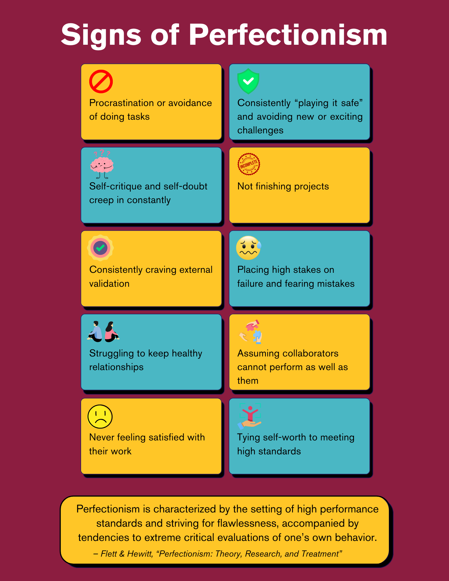
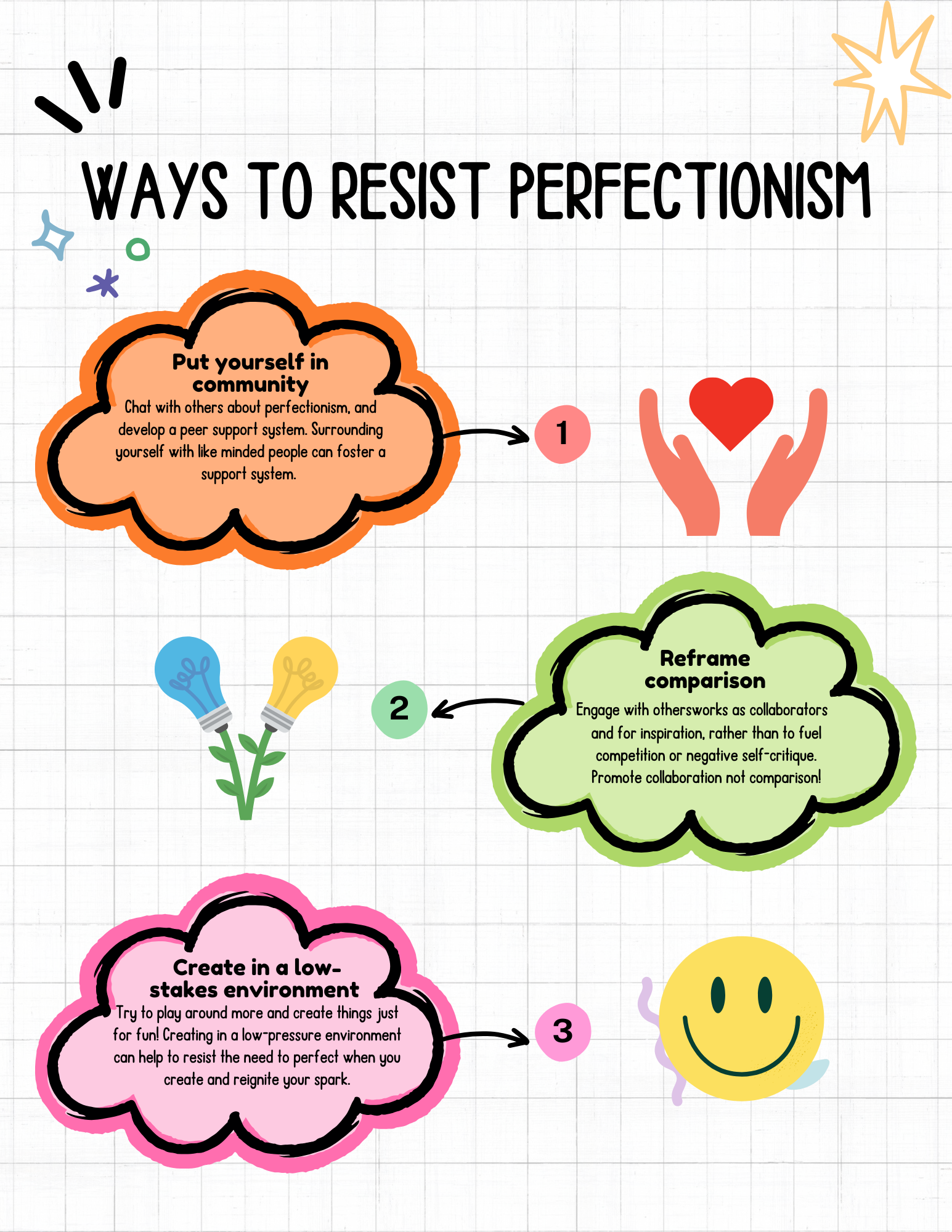
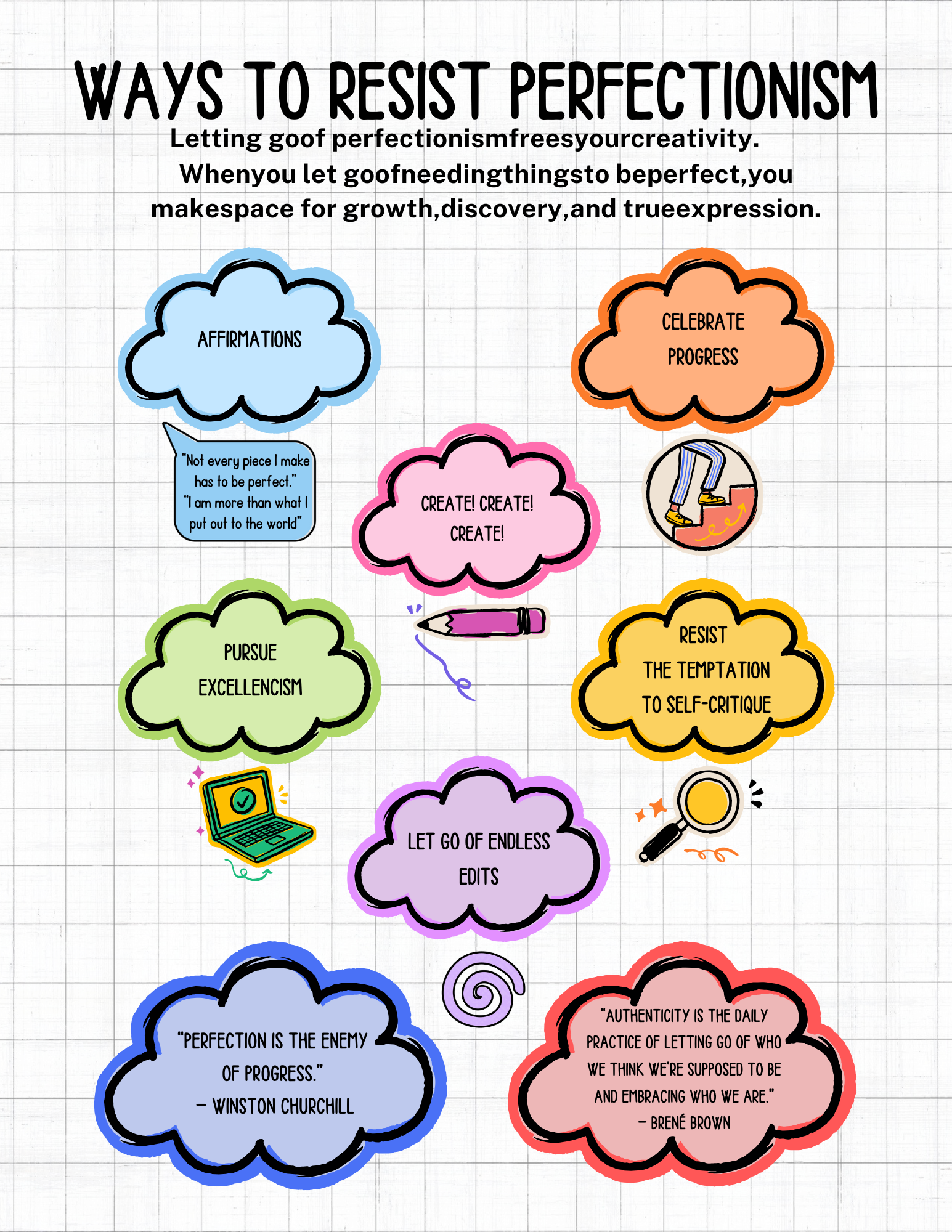
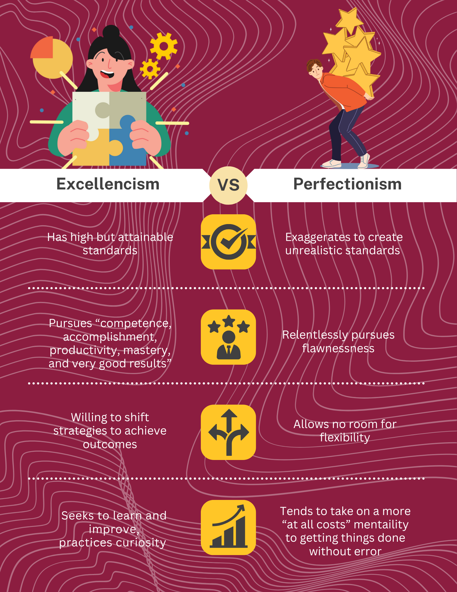
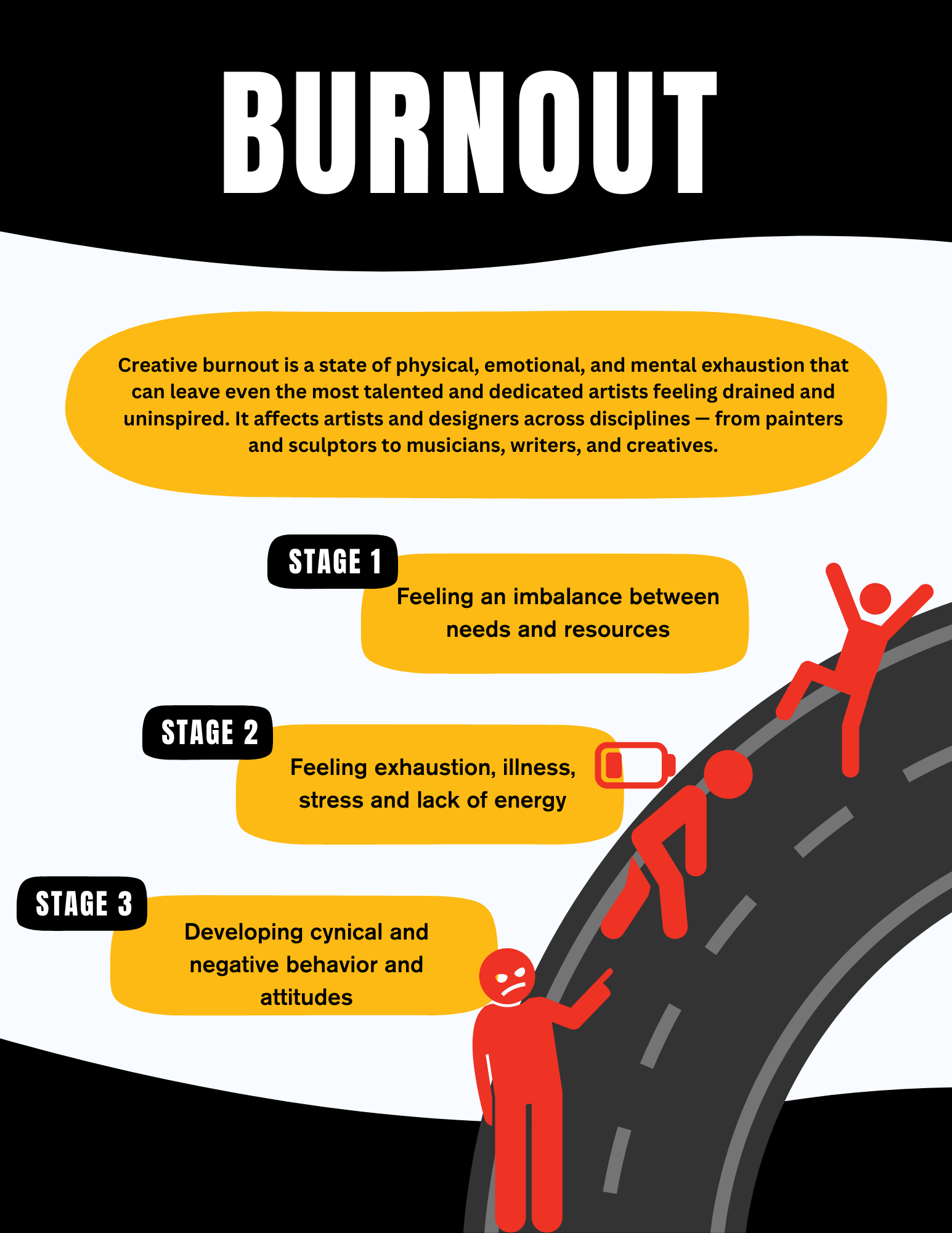
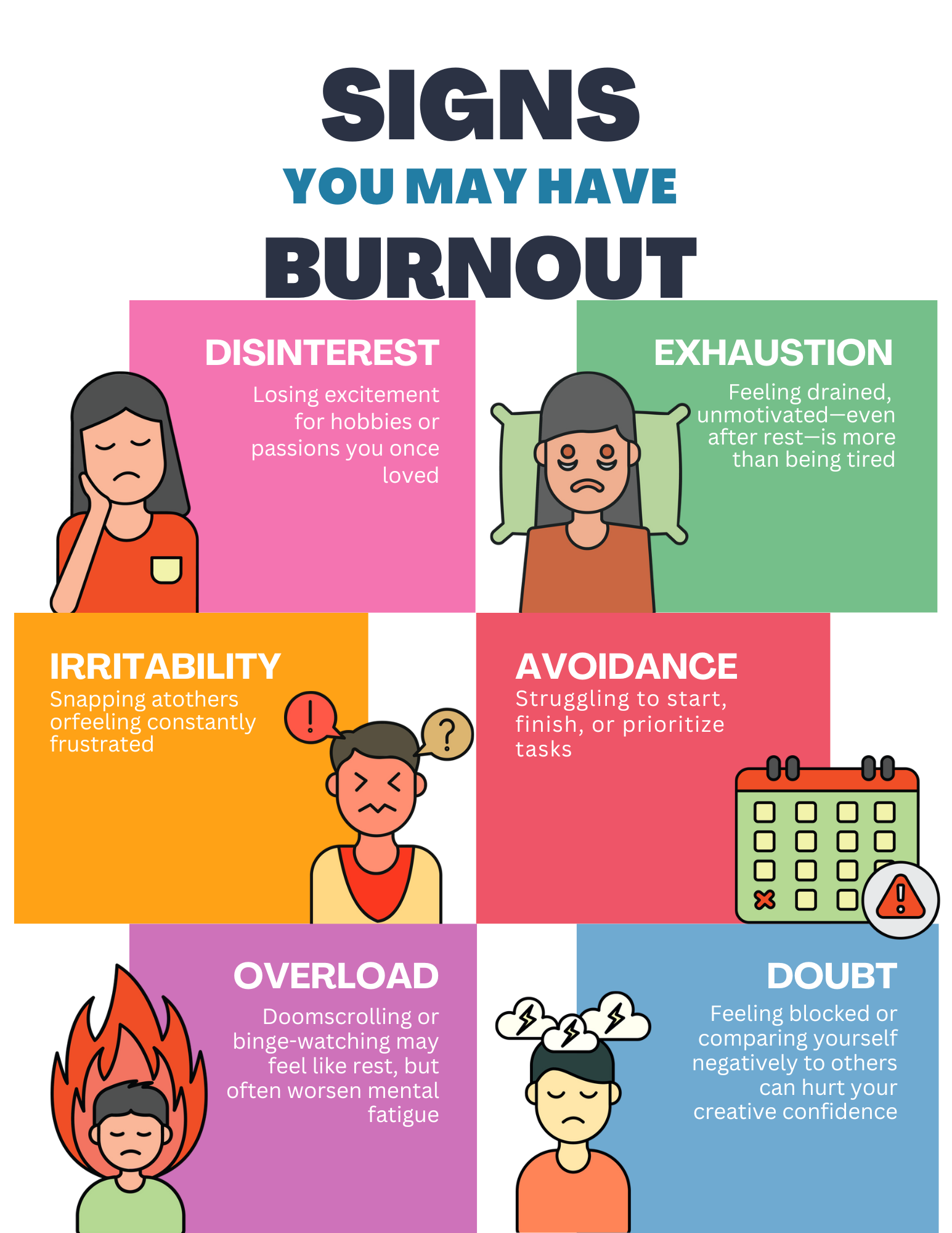
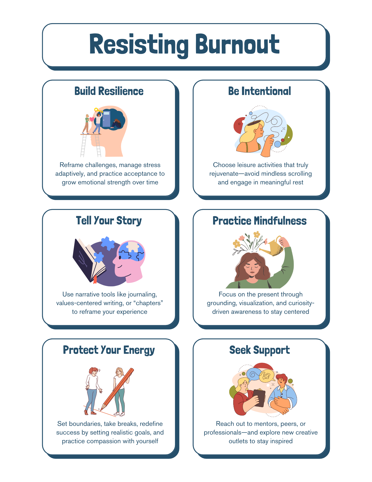
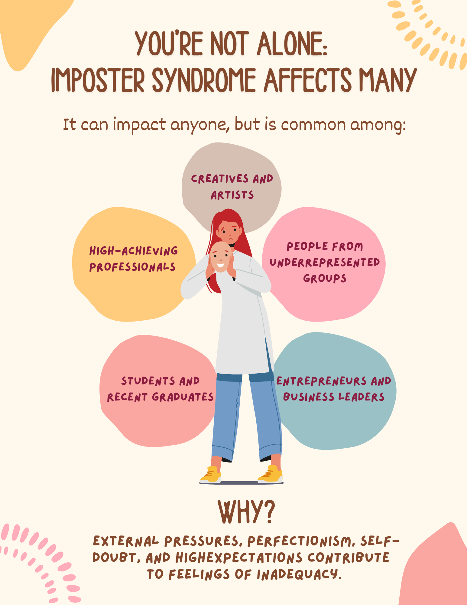
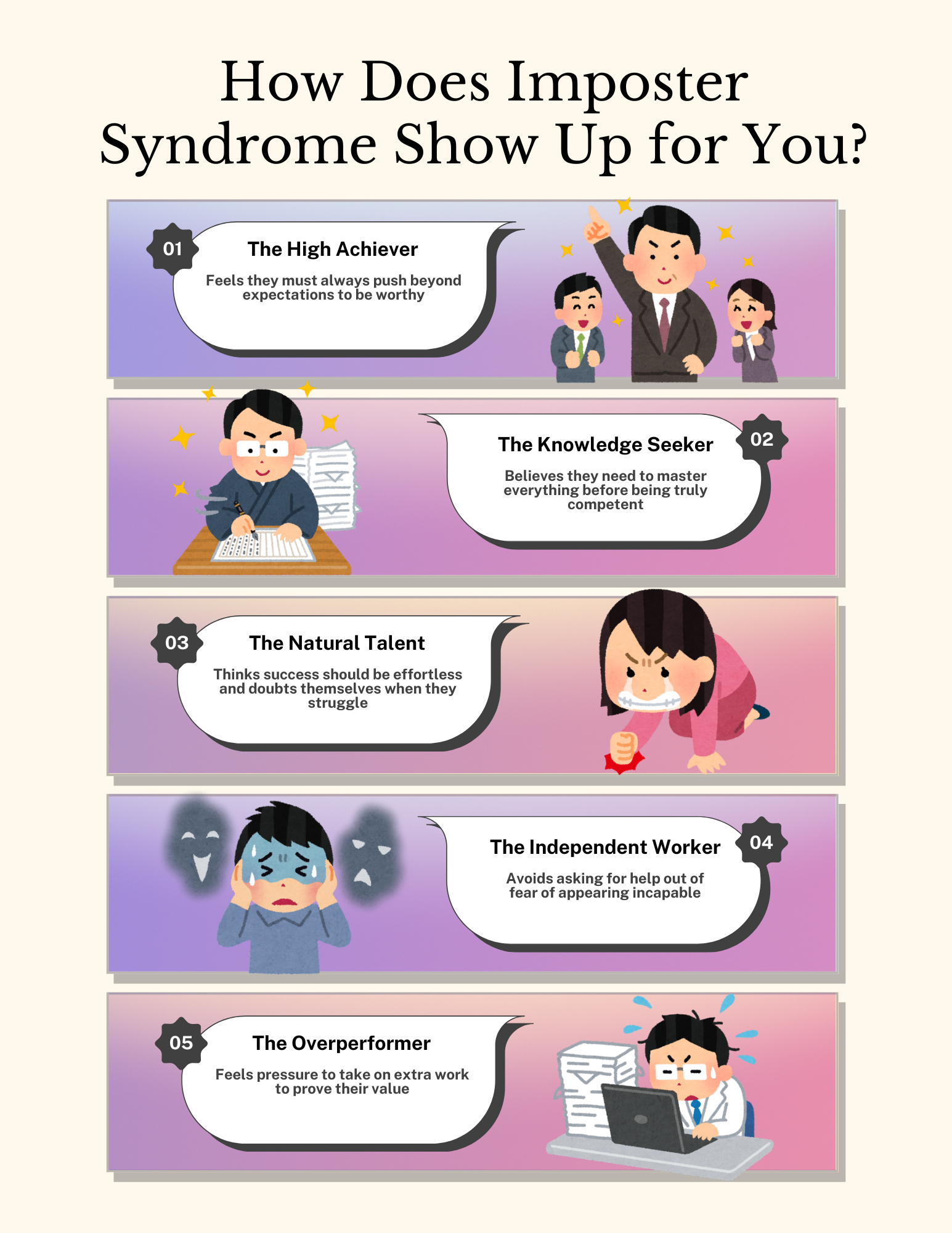
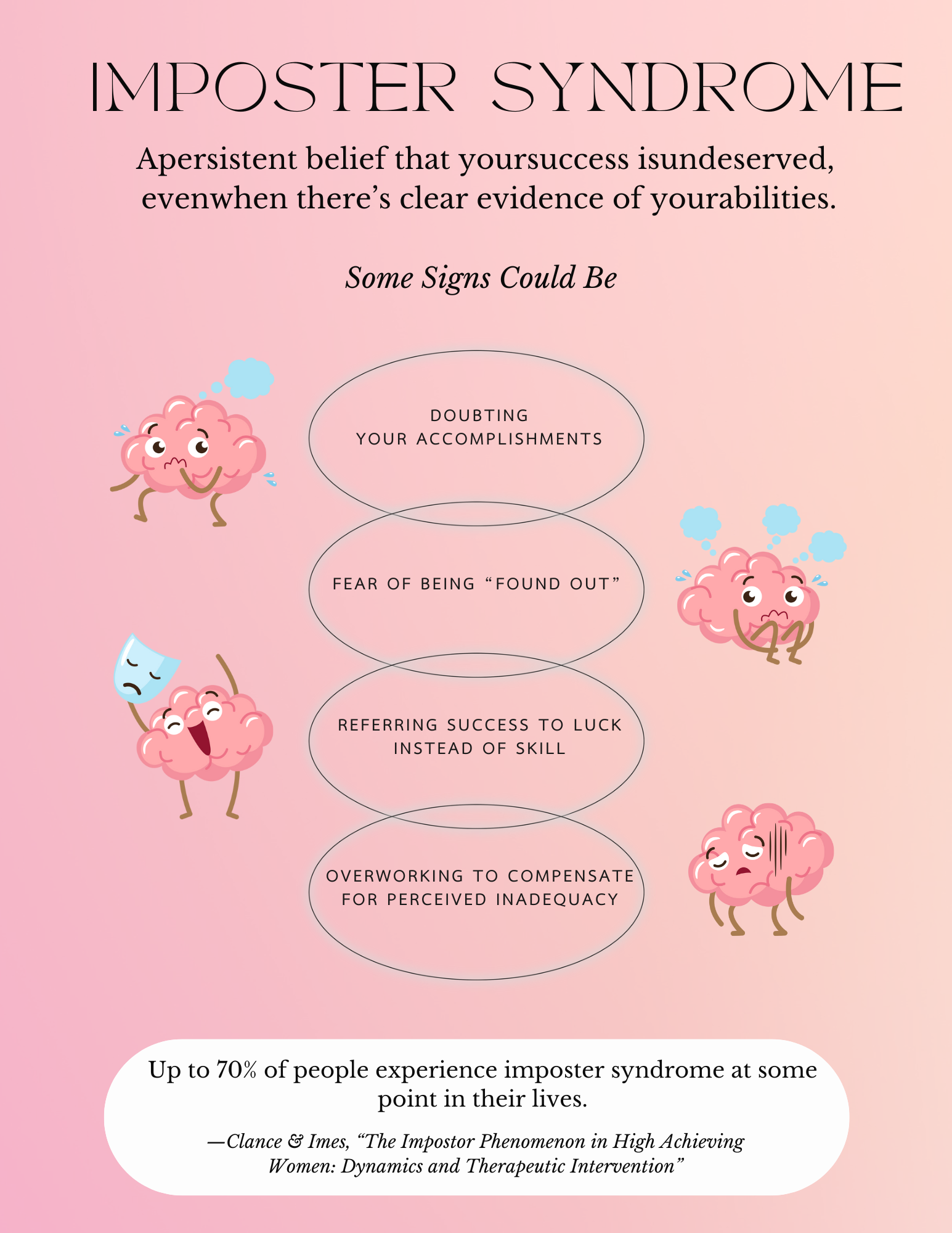
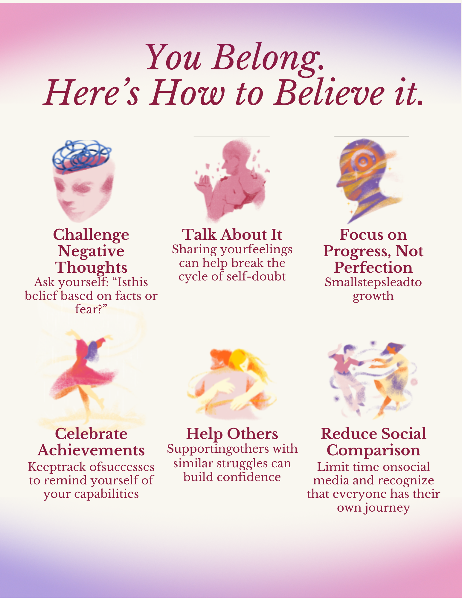
Being attentive to the brief. Working efficiently. Being responsive to feedback. These are the professional habits that matter in a first role — and they are documented here.
Self-initiated brand identity projects including Lint Away, Full Plates, Rattle, and De Novo Bakes — packaging, logotype, and visual identity systems across four different product categories.
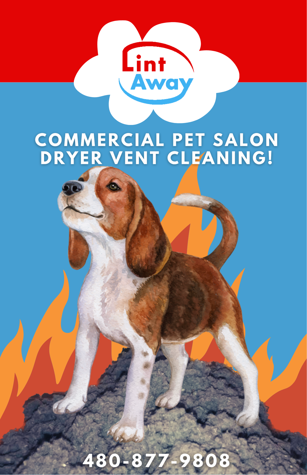
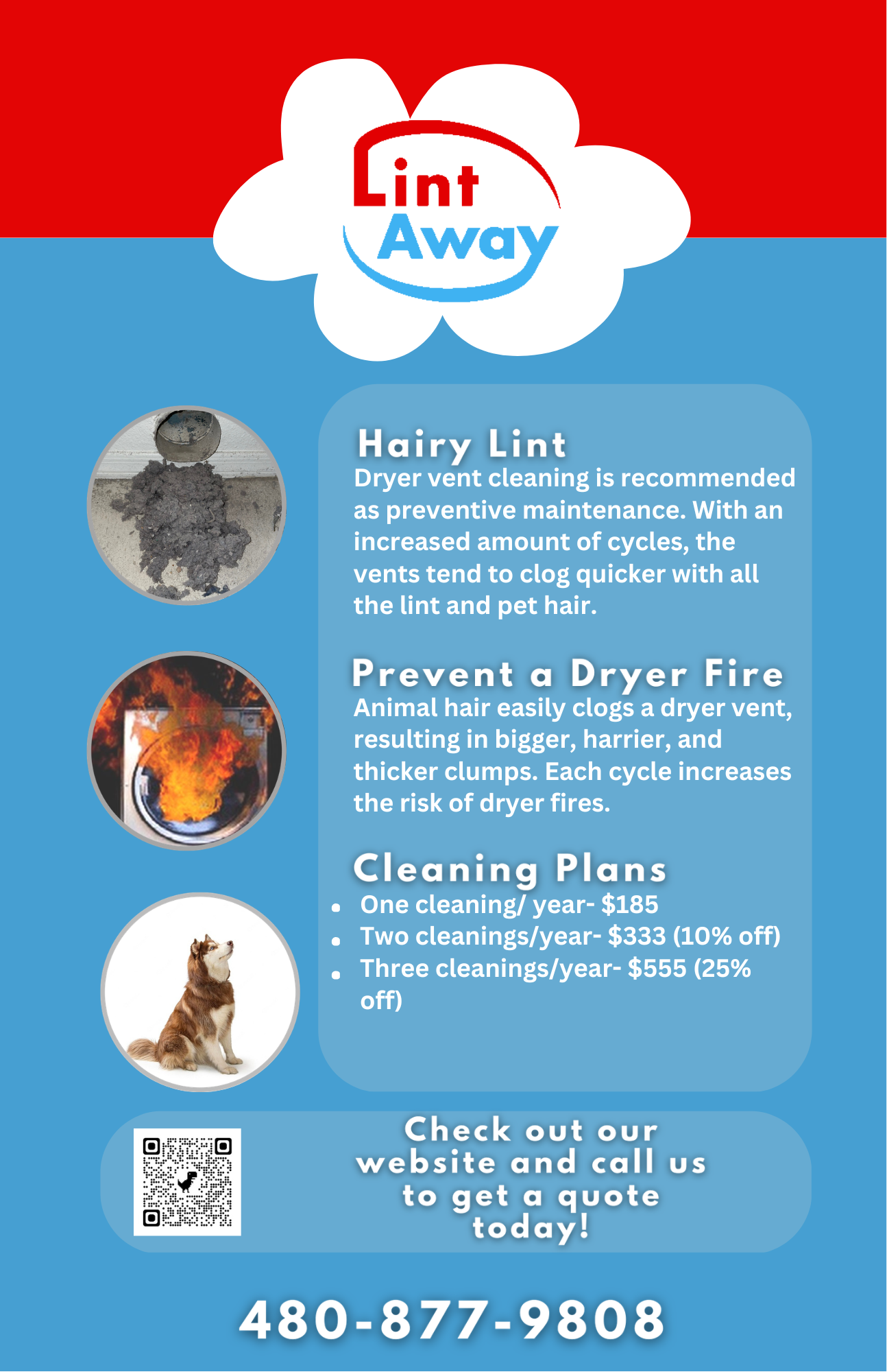
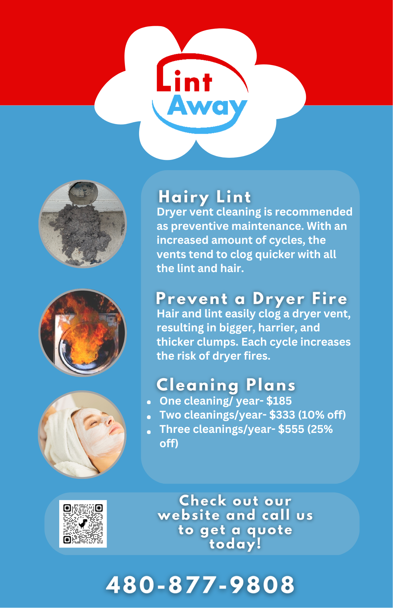
Lint Away's existing materials felt cluttered and dated — not matching the quality of the service they were actually providing. The rebrand needed to communicate "professional and trustworthy" to homeowners at a glance.
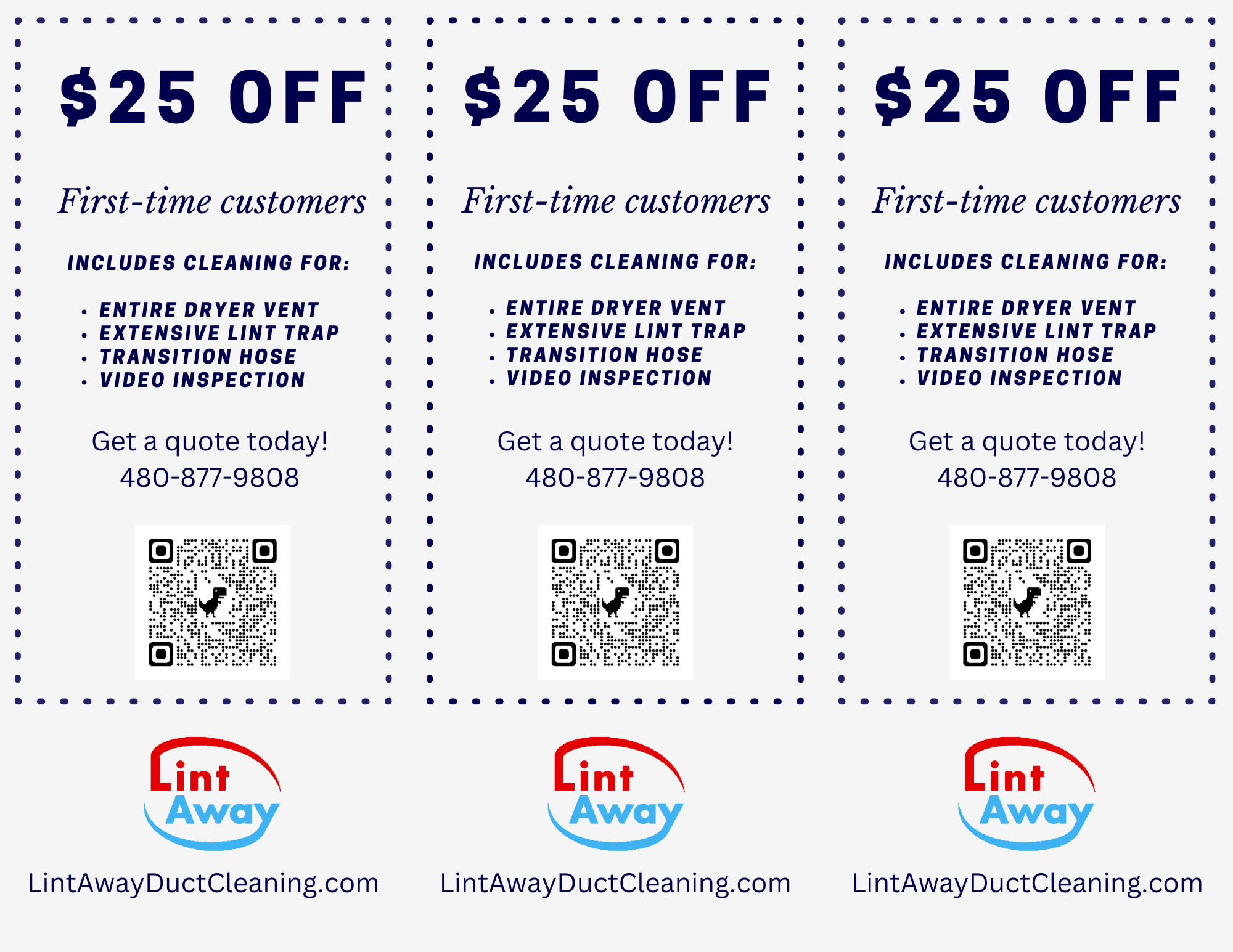
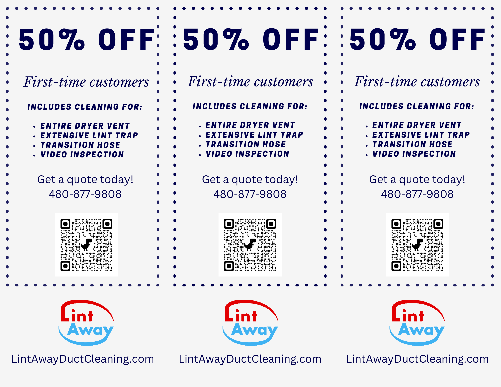
Over nearly two years of freelance work, I refreshed the full collateral system: logo refinement, a new mascot character (Big Clumpy), business card redesign, promotional coupons, and service flyers for residential, commercial, and specialty segments.






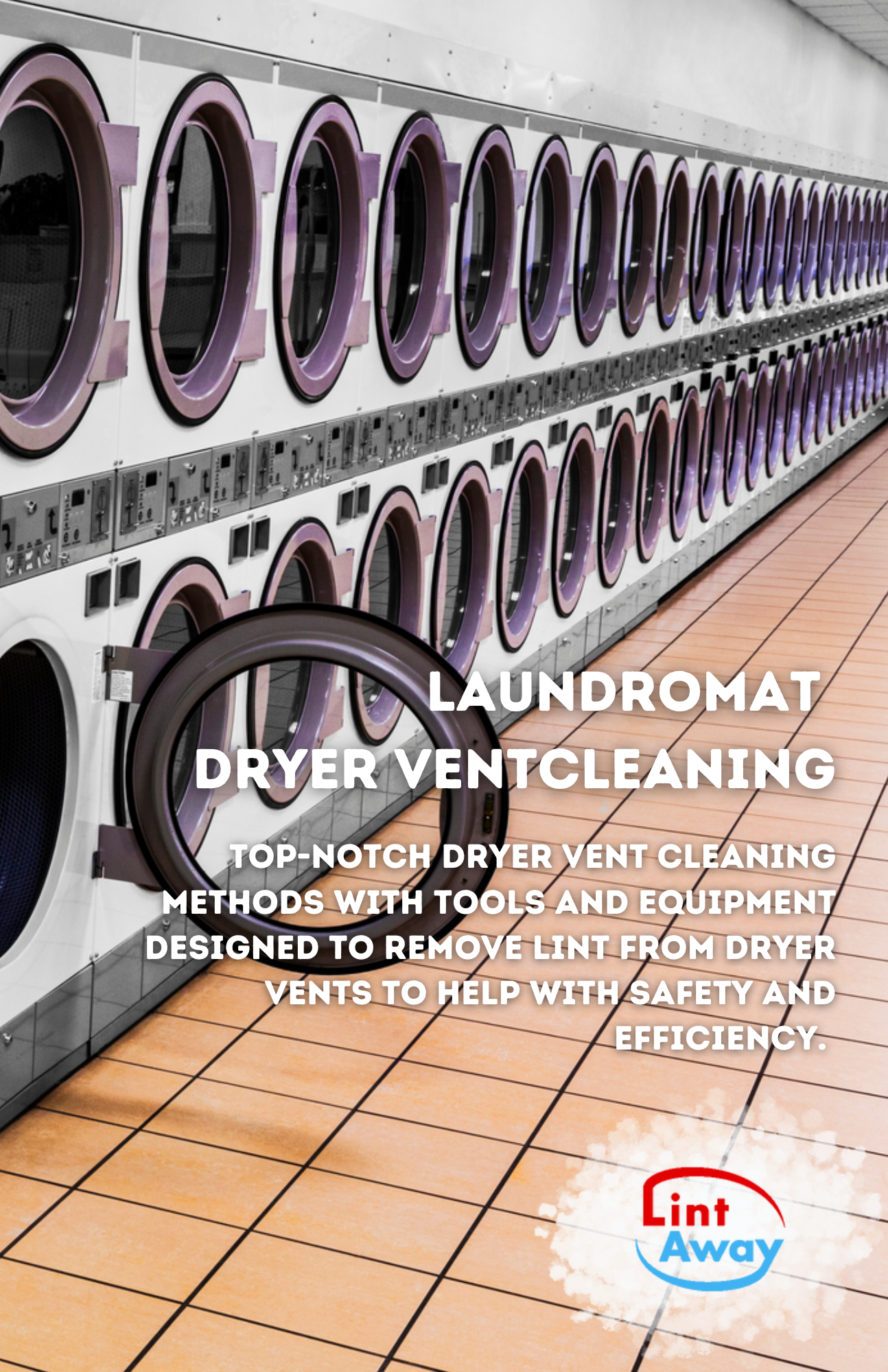
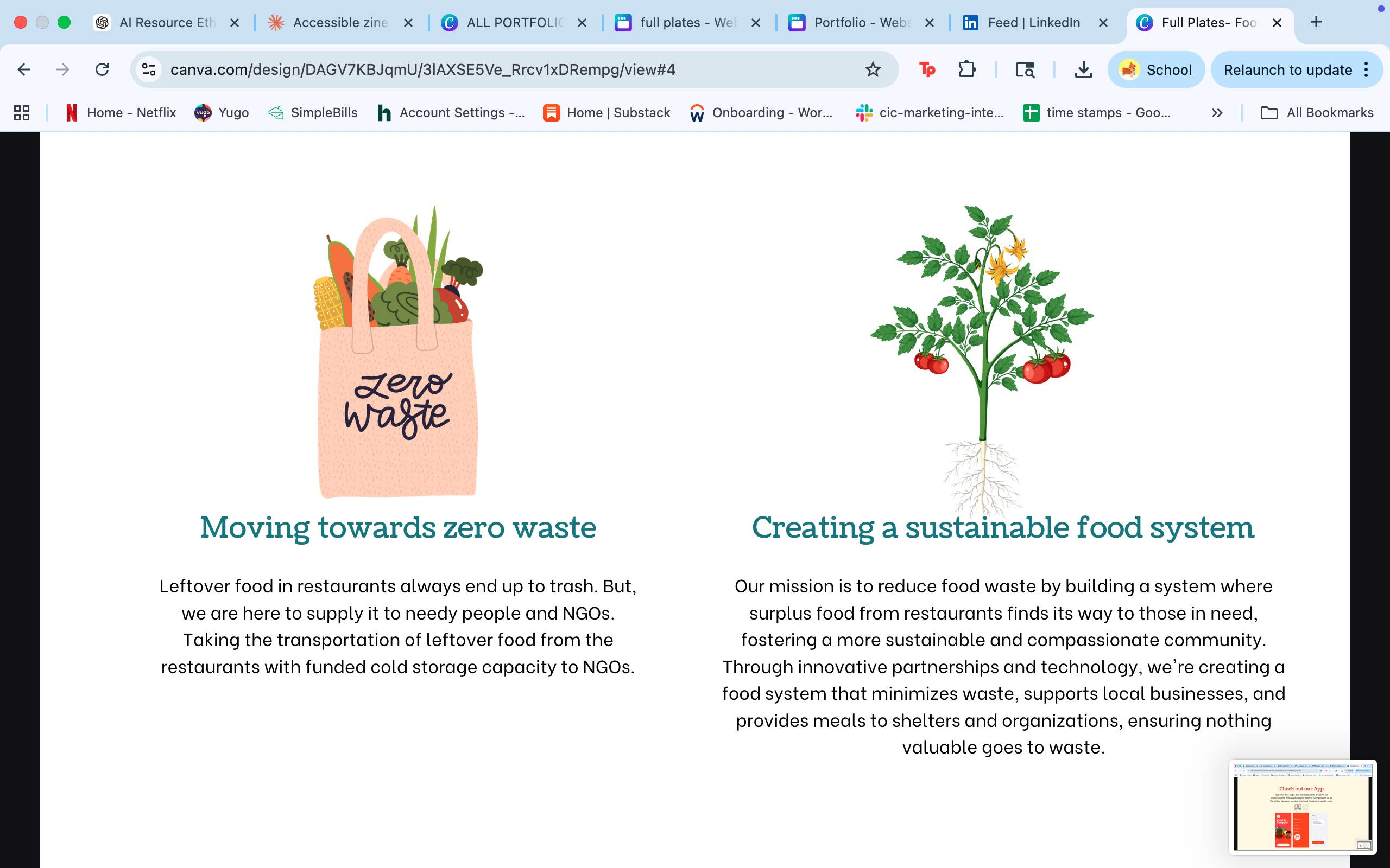
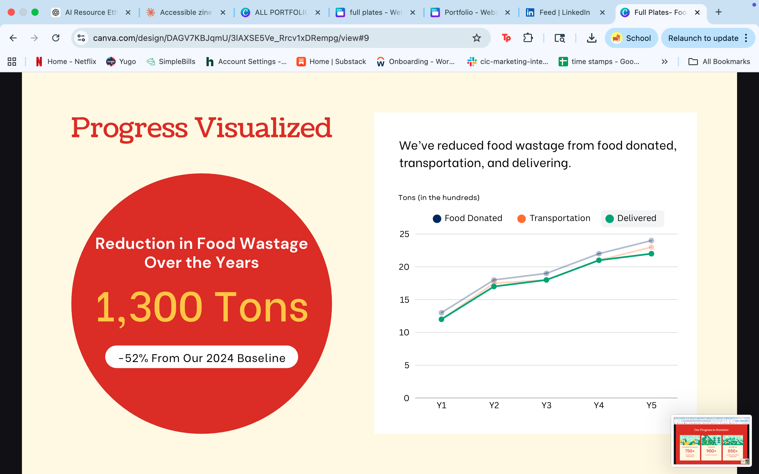
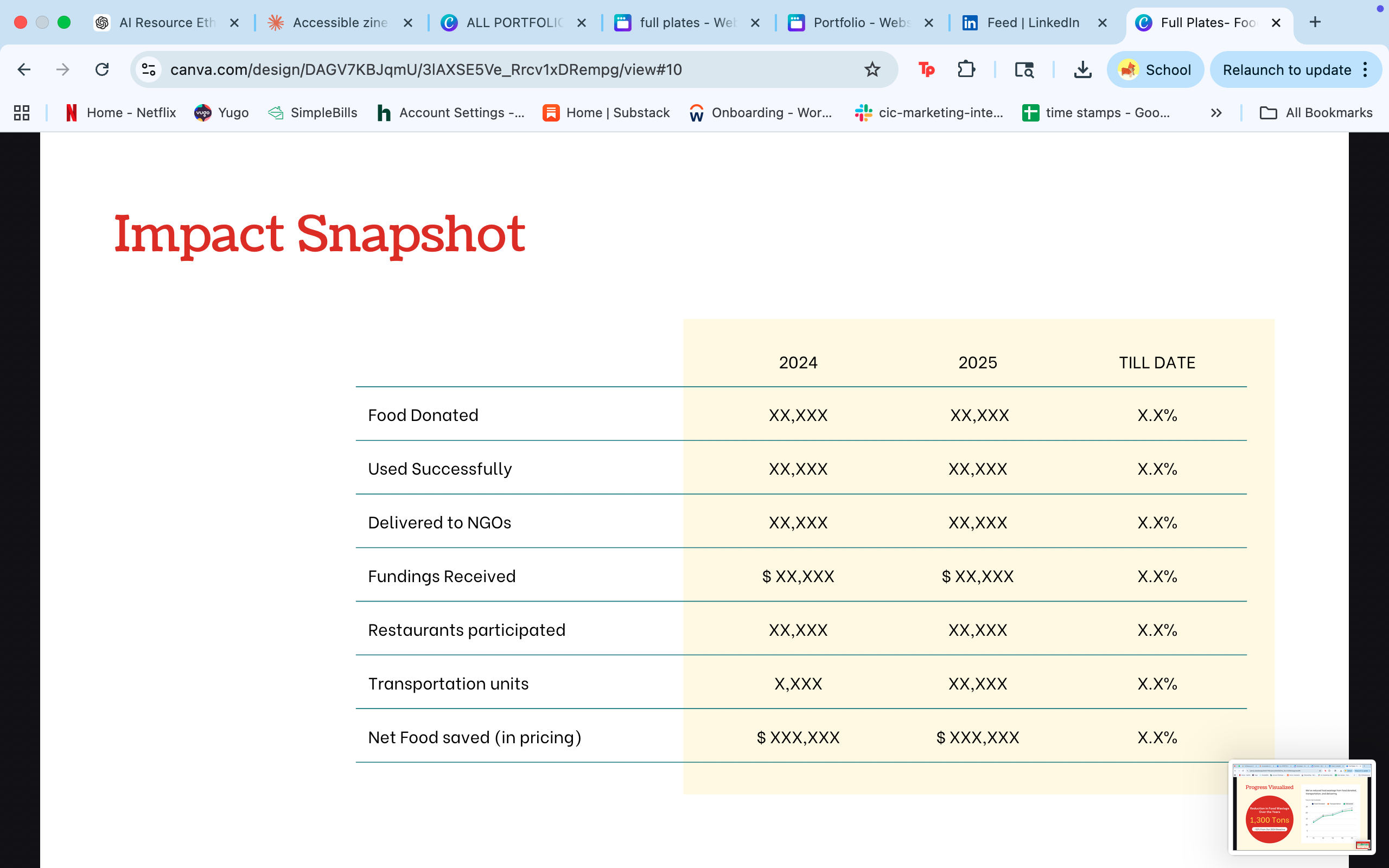
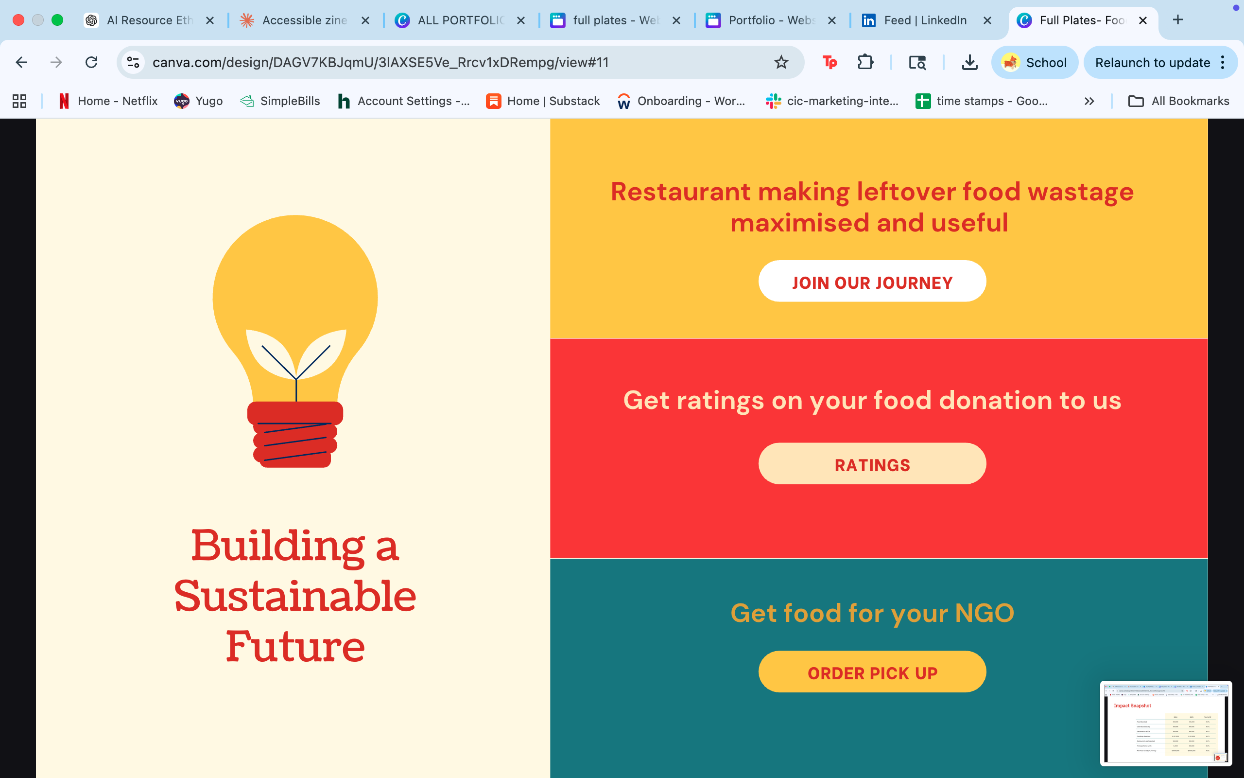
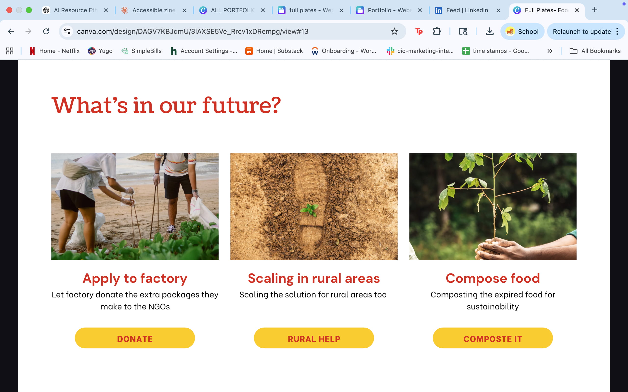
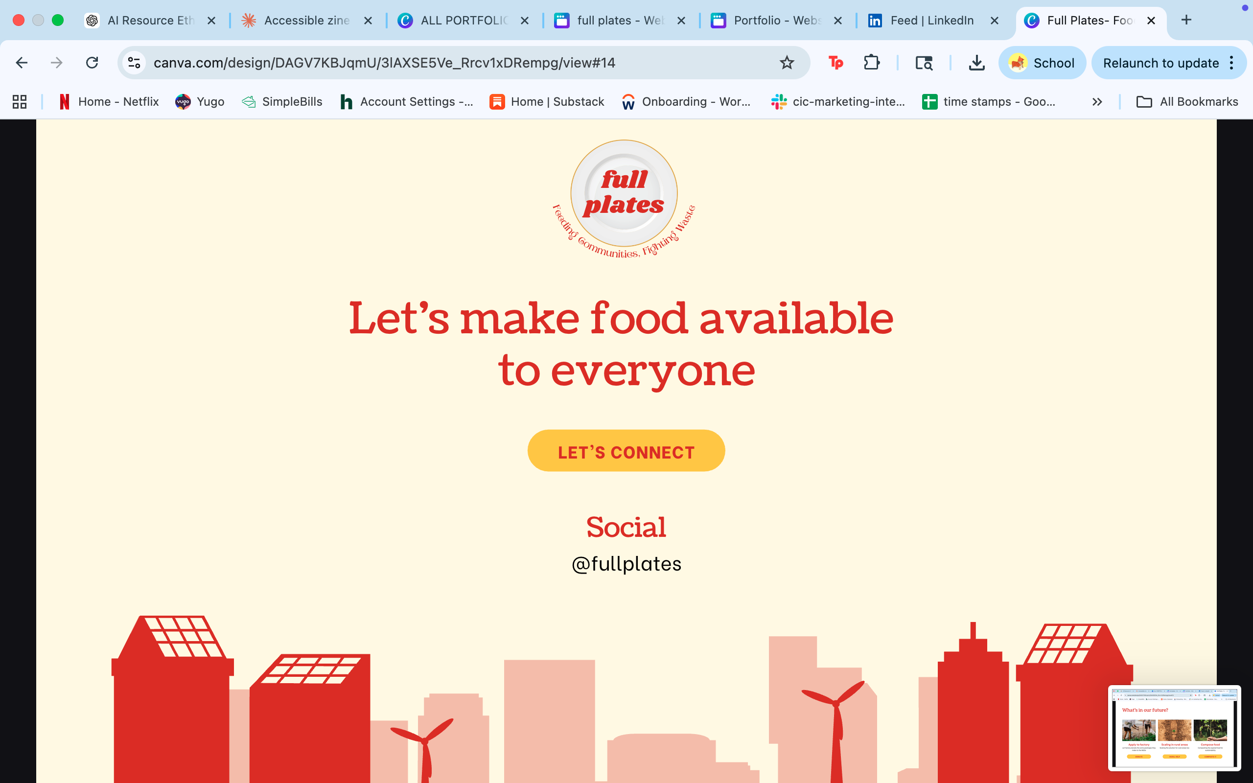
Full Plates began as a Hackathon project in December 2024 — a team concept for connecting restaurants with surplus food to shelters, NGOs, and communities in need. The tagline: Feeding Communities, Fighting Waste.
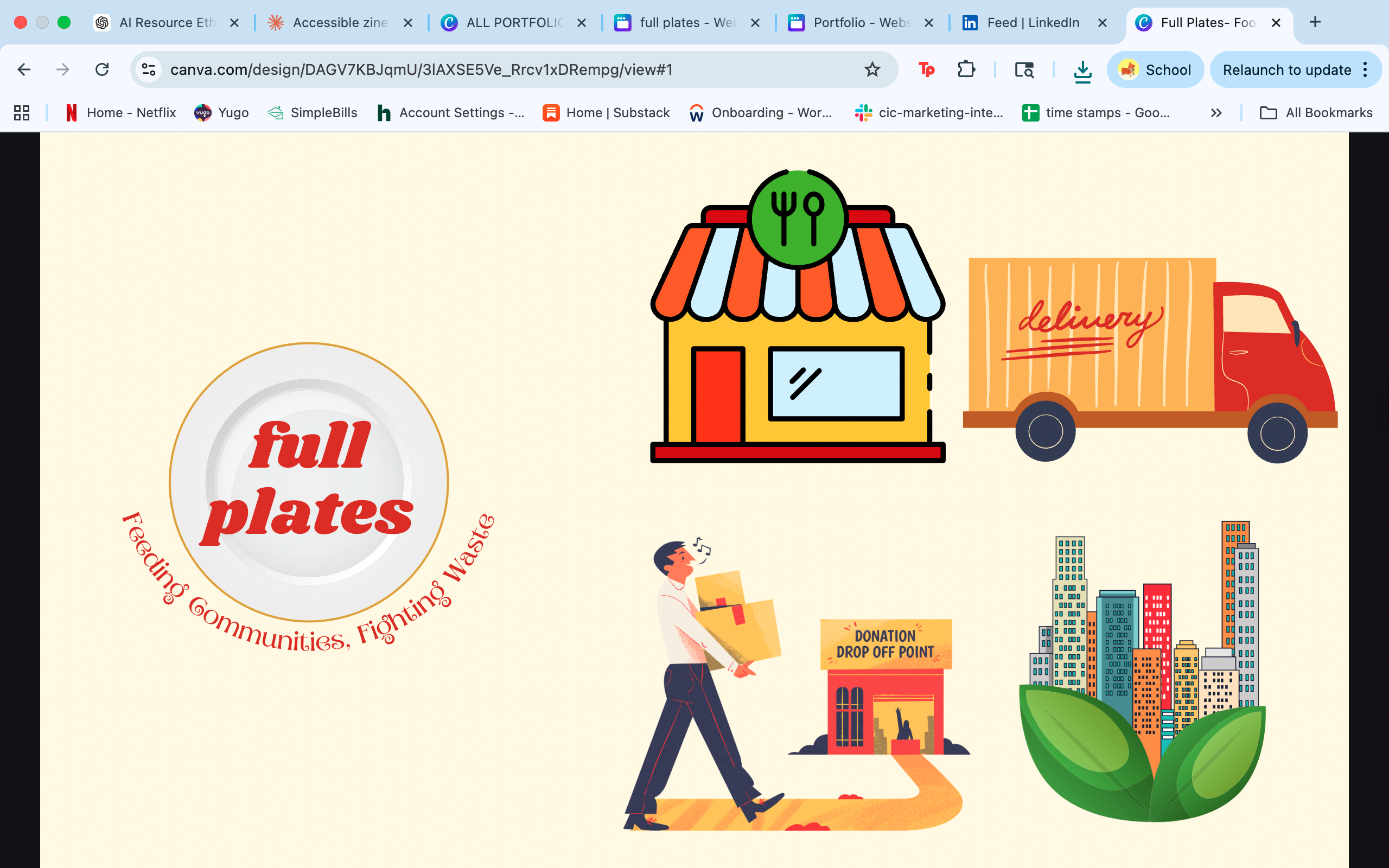
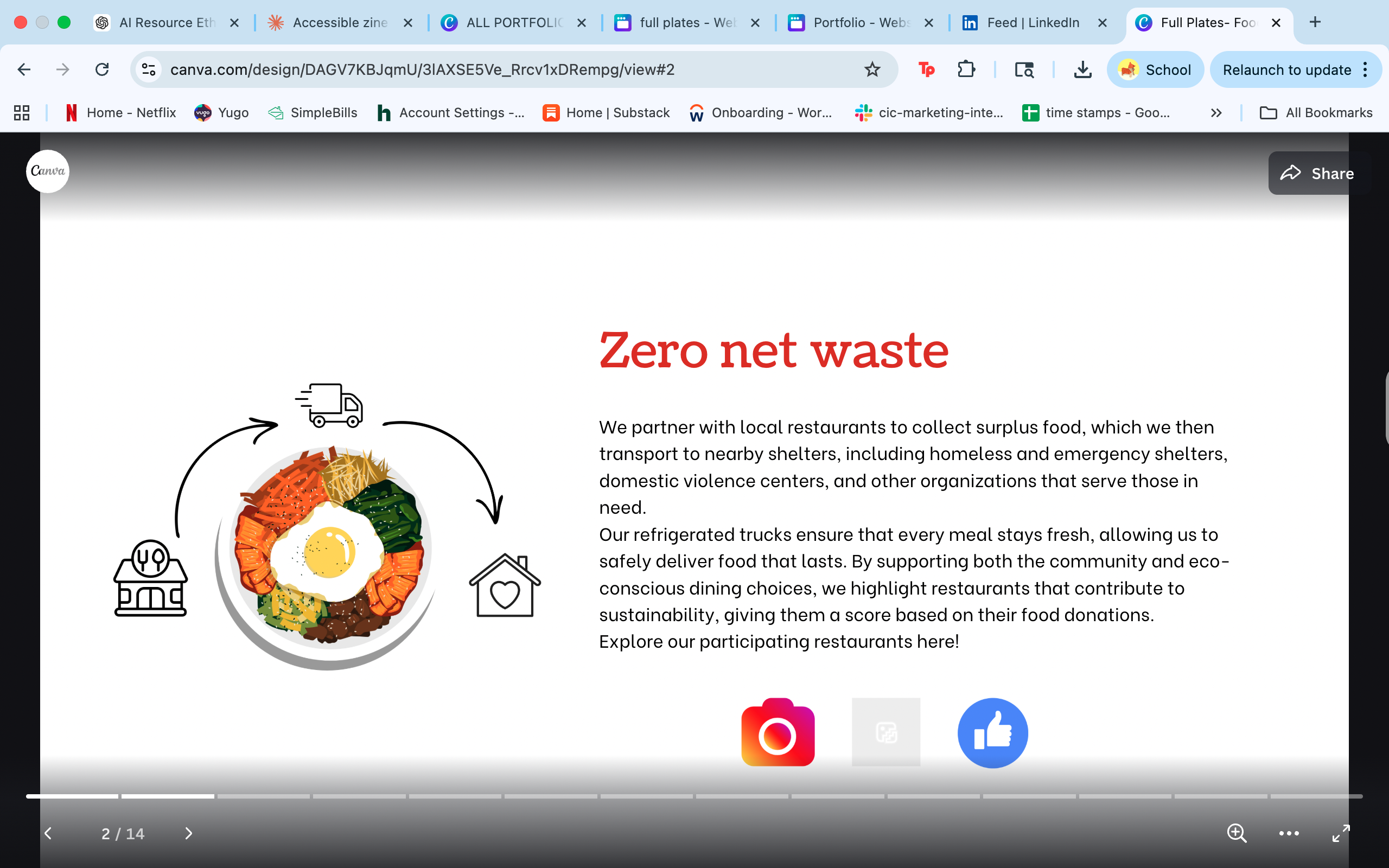
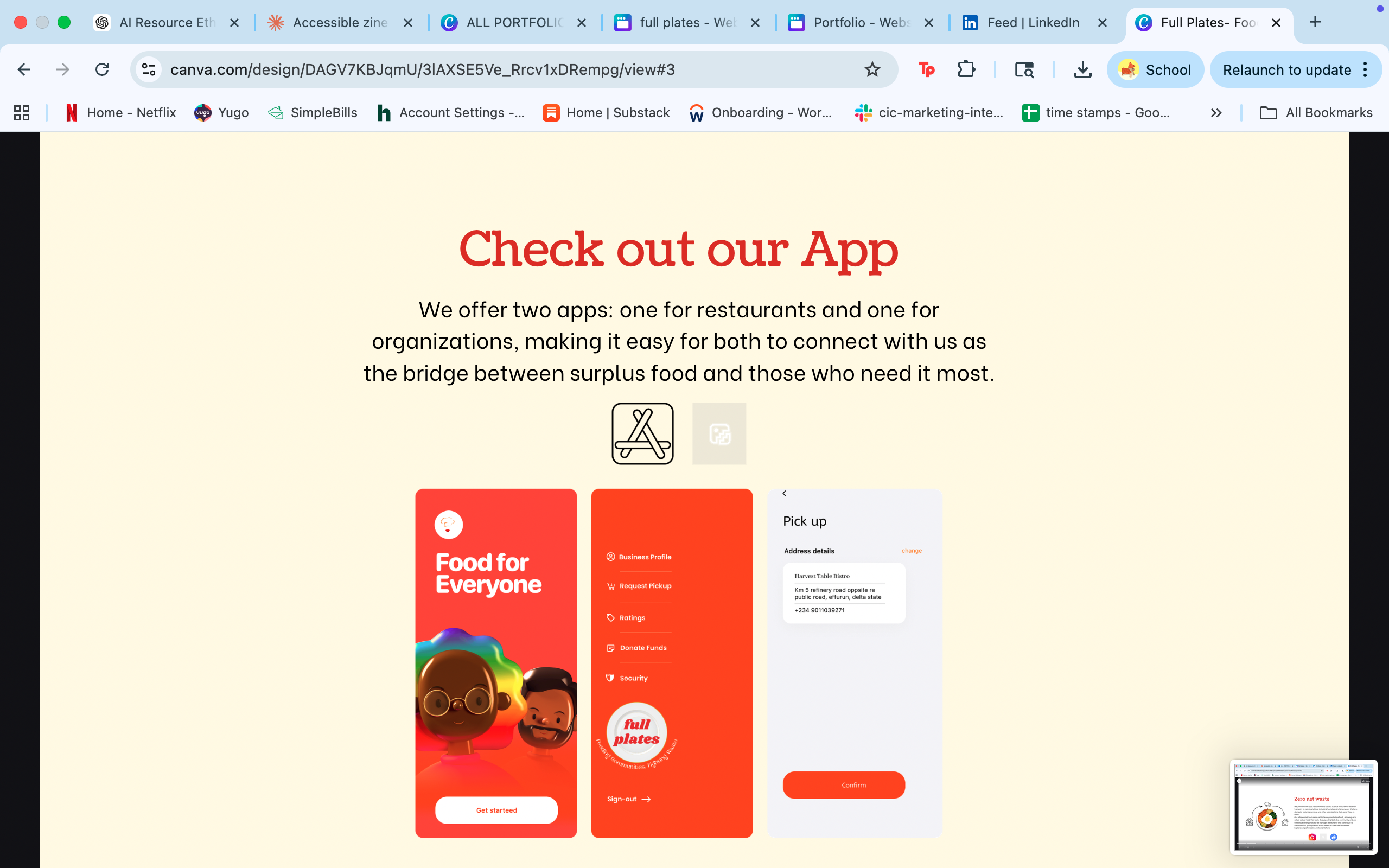
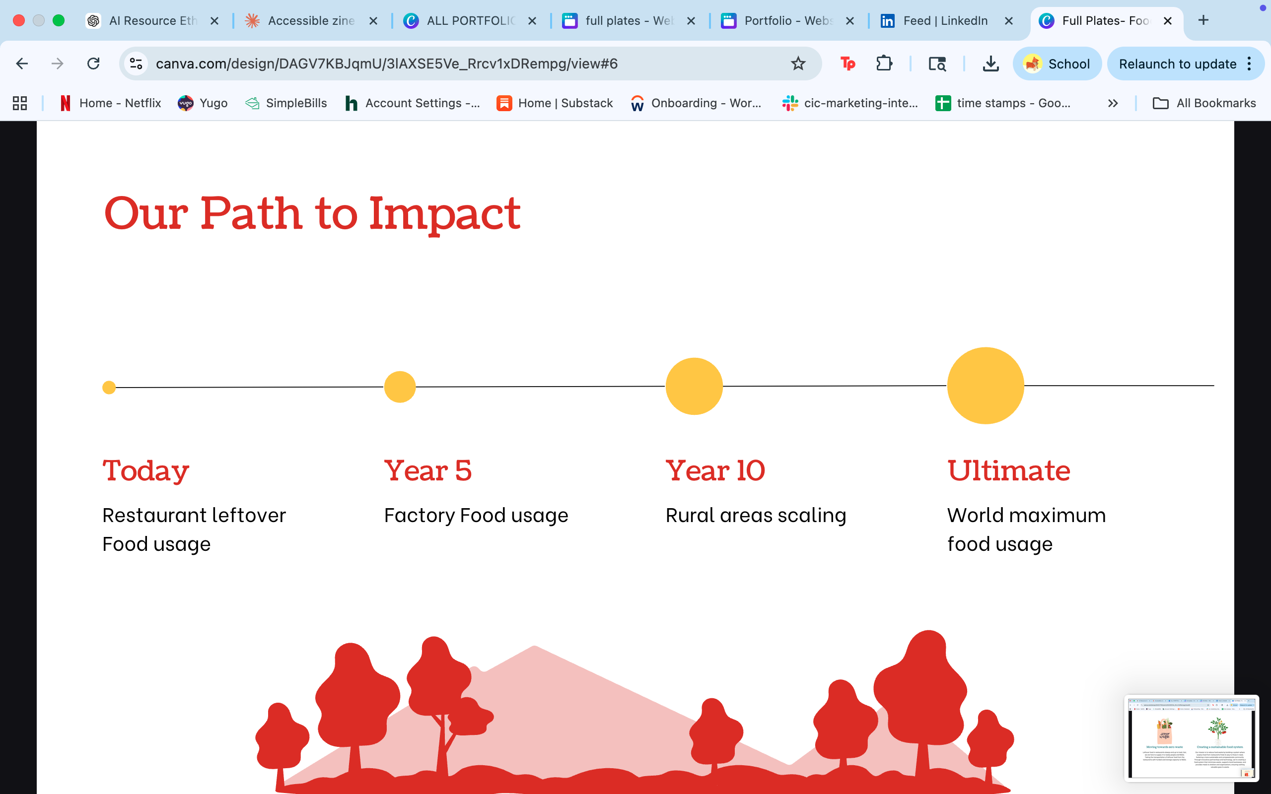
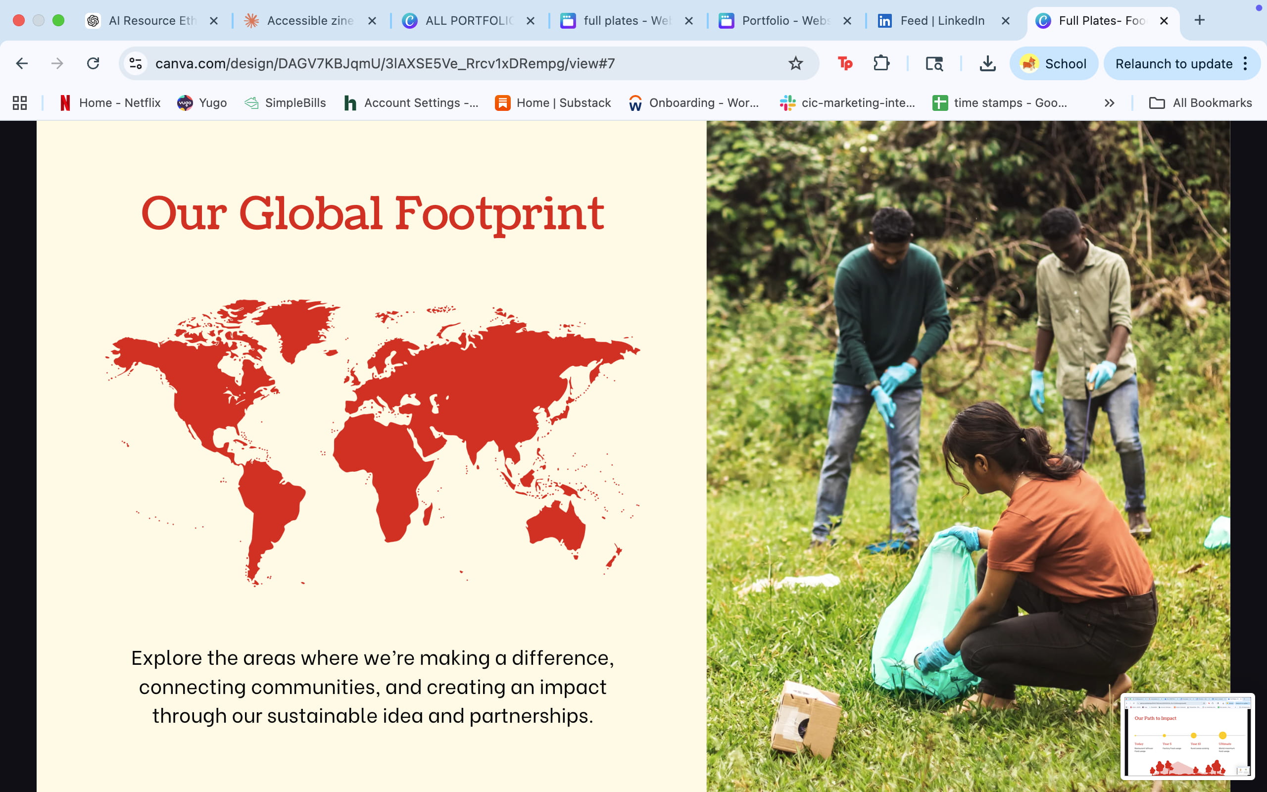
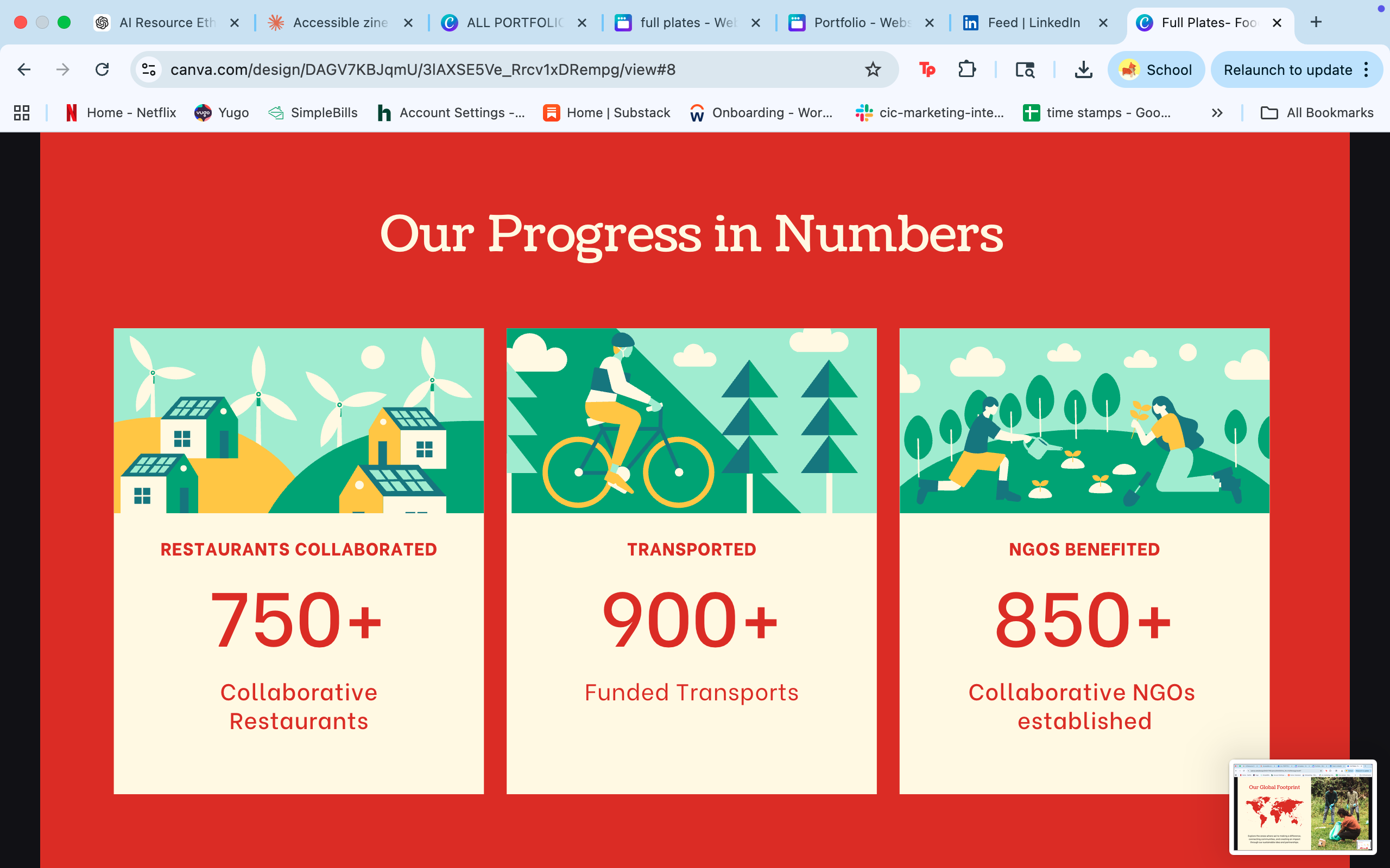
After the hackathon, I took it in my own direction. I built out the full brand system and website prototype — 14 pages covering the mission, app design, zero-waste model, impact metrics, and a global growth roadmap — then extended it into a zine and policy brief exploring food redistribution through law, logistics, and design.
In my junior year at ASU, I developed a world built around an imagined community food system — integrating social networks, wellness rituals, and emerging farm technologies. Across three documents, I mapped the world's geography and daily life, then dove into Rattle: an innovative natural-cultivation technology designed for Arizona's climate.
This project blends speculative narrative, systems design, and visual prototyping to explore how people might live, eat, and care for one another in a future food-centered culture. It sits at the intersection of design fiction, policy thinking, and technology concept work.
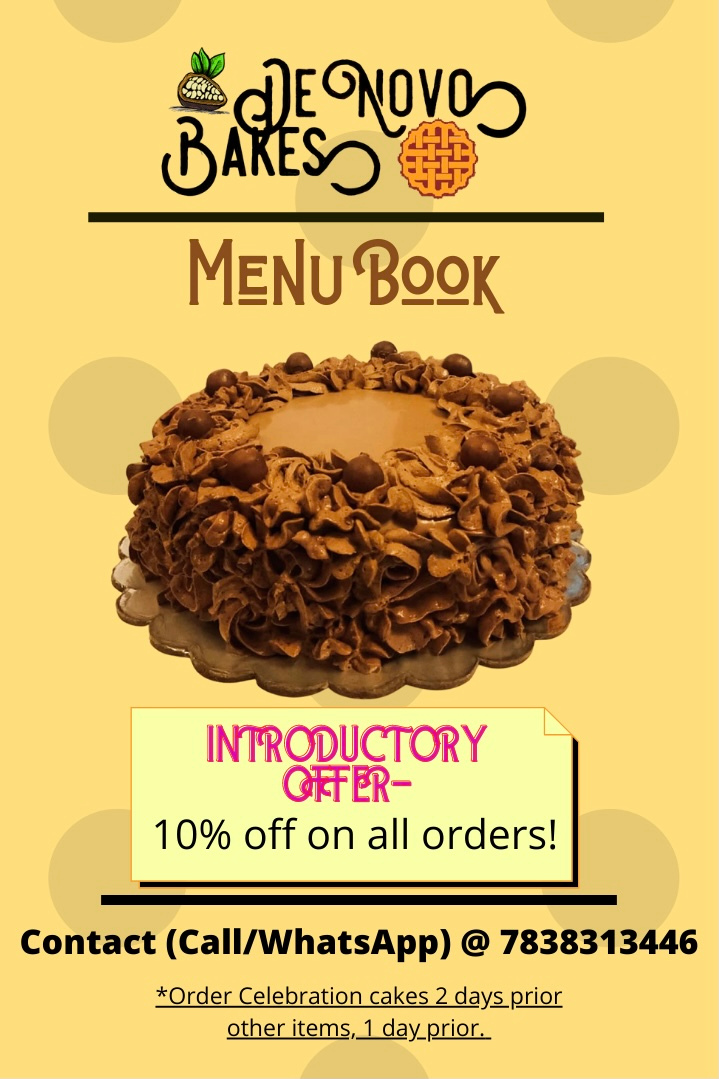
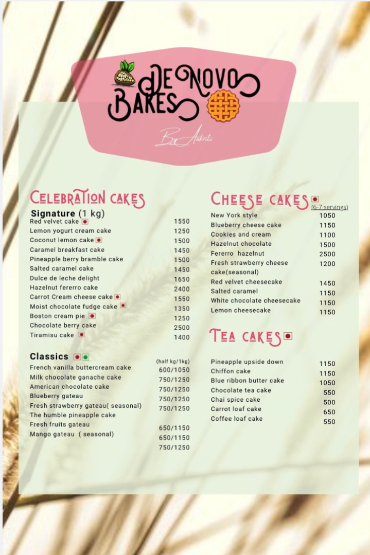
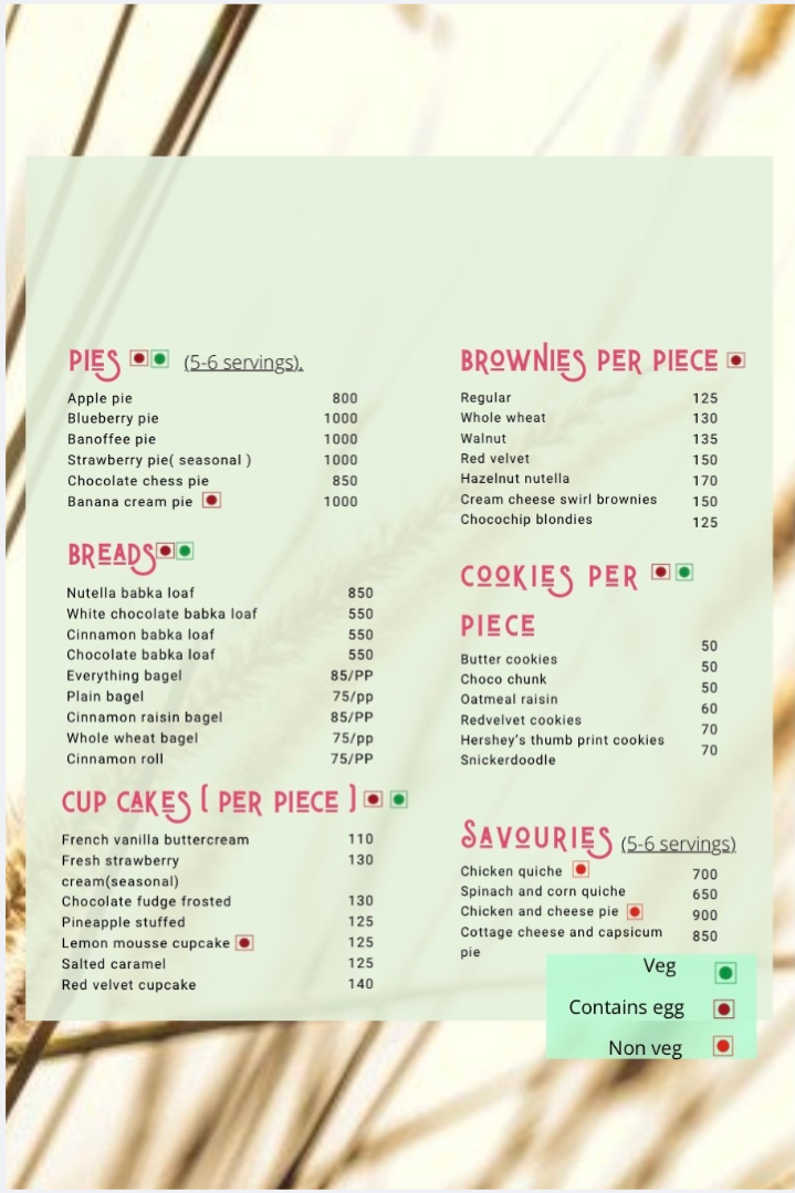
De Novo Bakes was my very first freelancing project — a cloud kitchen bakery run by Aakriti that needed a full menu card to match the warmth and personality of everything she baked. The brief: make it feel handcrafted, appetising, and easy to read at a glance.
The result was a 3-page menu book — cover, cakes, and everything else — with a soft yellow palette drawn directly from the brand, custom typography pairings, and clear dietary indicators for veg, egg, and non-veg items across 60+ products.
Every project since has built on what this one taught me: that design for a real client isn't just about making something look good — it's about making their product feel real to someone who's never tasted it.